Ottawa Transport — UX Case Study
Case Study to understand the problems with the current transport digital services and identify possible ways to improve the Ottawa transport experience.

As a daily commuter on the capital’s buses, I have to struggle to navigate it through a variety of apps and printed schedules, that all fall short to make my commute efficient or friendly. In this independent research case study, I attempted to understand the problems with the current applications more in depths, take a closer look at the commuters and the users of the system, understand their journey and needs, and identify some design solutions that could improve the overall experience.
The problem
The bus system in Ottawa is relatively hard to navigate, especially for commuters whose destination is outside of the heavily served downtown area. The buses are also often delayed and full, due to weather and traffic.
The applications and website currently available for commuters to plan their trips seem to be lacking important services.
Research
Interviews & Observations
In my daily commute I started paying attention to how people navigate the system and where they get their information about the buses.
Additionally I started approaching a few colleagues and regular bus commuters to learn more about their experiences and what they would like to have in their applications.
The majority of commuters, especially during peak hours, are daily commuters who have just memorized and perfected their routines about when they need to catch the bus to their destination.
There are other commuters, who usually drive to their daily destinations but occasionally- when their vehicle is not available, or if they are going to a different destination- chose to take the bus. This group is the one that struggles most, as they are not familiar with the schedules, and are seen using their phones- mostly google maps- to try and figure out which bus to take to their destination.
Given the way Ottawa’s bus network works, a common strategy for a lot of commuters is also to get on any bus that is going to the the downtown hub first and find the specific bus that would take them to their destination from there, where they are likely to find more frequent alternatives.

Summary of current Challenges
- None of the apps that offer GPS tracking information offer the options to search for bus alternatives by destination. They assume commuters’ knowledge of either the bus stop number or official name, or their knowledge of which bus number they are looking for.
This information can only be found by using maps or the OC web planner. - There are frequent delays and changes in the schedule, so that the official printed schedule is considered unreliable for planning the commute. Buses also often arrive earlier than scheduled.
Especially during rush hours or bad weather, the schedules become almost impossible to depend on. - Major bus stations, have several bus stops in them (e.g. 1A, 2A) which are listed as separate stops on all the applications as well as, making it harder for users not familiar with the system to find their bus.
- During peak hours, when buses are too crowded, they often don’t stop in stations where no passengers need to get off the bus . There is no way for commuters to know if the bus will not stop and often have to miss buses they have been planning to use for their commute.
Review of Existing Apps
The next step to understand the problem was to review existing applications that are intended to help commuters navigate the transportation system. I chose 3 applications to evaluate.
Note: I didn’t spend a lot of time evaluating the OC transpo website- which includes a travel planner as well as all the information, since it is not considered mobile friendly and is rarely used during the commute.
Ottawa Transit
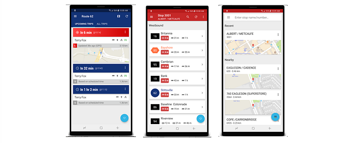
OC Transpo is one of the most popular apps used. Overall it has very good ratings (4.2 on Google play from 865 users). The GPS tracking works well most of the time and it allows users to know when to expect buses accurately.
The primary issue with the app is that users can only search bus stop name or bus number as highlighted from one of the reviews.
“This app is great. The only thing that would make it awesome, is if it synced with Google Maps and I would be able to put in my destination, and it would tell me which route to take. Right now, I’m switching between Google Maps and this app pretty regularly to see my route, and then to check when the GPS on the bus says it’s coming.”
In addition the tracking only shows the three next buses, so it can only be used during the commute and not for planning ahead.
Bus Buddy

This is another very popular app used. The ratings of the app are slightly worse than Ottawa Transit (3.9 on Google play from 871 users). Both apps allow for favouriting routes and buses to make frequently used ones easy to find.
Bus Buddy however suffers from the same issues as Ottawa Transit, mainly the lack of a trip-planner, in addition to a less than friendly user interface and dated look.
“ [...]it’s confusing and less user friendly than using your Web browser trip planner on your phone.[…] how are you supposed to find your bus stop in a non- alphabetical list efficiently”
OC Destination
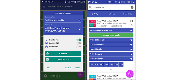
Even though it is a less popular app, the reason I chose it for the evaluation is that the developers of it chose to leverage the trip planner from the OC transpo website to offer an advantage over other apps in the stores. It also seemed more promising based on the reviews (4.8 on google play — although reviewed from only 32 users).
Unfortunately however, the linking does not work as smoothly as expected. The app automatically takes the user the the OC transpo website, but has failed to offer a way to go back to the app easily. The user has to remember the results they found and do their own search on the app.
Personas
Following the interviews and research, 3 primary user profiles were identified from interviewing and observing the commuters. Their profiles outline their frustrations and primary goals to guide the ideation and design of the proposed service.

The Journey
Following the research and with the personas it was helpful to map the journey of a commuter. The journey does not follow a single identified persona, but I kept it at a higher level to help in identifying the common pain points and challenges for all users.
I used the identified pain points in the journey to start the ideation process for services that would address these challenges.

Ideation
Following the research and the journey mapping, as well as researching similar case studies for other cities and other transport app , I put together a list of potential features and services that could improve the overall experience.
The following are some of the most important services identified to improve the transit experience:
- Search by destination: From the research and experience this is the most obvious need. Users should not know the bus stop names or bus numbers but be able to search for routes by destinations. This can be through an integration with other map services.
- Recording frequent destinations rather than frequent buses. Allowing the user to save destinations they frequently go to, to find optimal routes to them, depending on time and conditions at that time.
- Notifications: User can chose to receive notifications, to be notified when they need to start to go to the station, or when they need to be alerted to leave the bus.
- Stop Alert: The buses right now require passengers to alert the driver when they need to leave the bus. To avoid commuters being stranded in stations where the bus doesn’t stop, there could be a way to alert the bus driver to stop in stations for people to get on the bus as well. This would also optimize stopping times and potentially reduce delays.
- Crowdedness level: This can also alert commuters when there is a chance that a bus will not stop. Commuters if not in a hurry could also chose to take later buses to find seats. This feature would be also be extremely useful for commuters in wheelchairs, or with strollers who require the extra space.
- No show or late bus report: this is feature that can help commuters feel more in control, when there are delays or issues with the bus schedule. They can that way contribute to troubleshooting and potentially optimizing the bus routes and schedules.
- Stations GPS trackers: Using mobile devices in cold or stormy weather is always a problem. Since the GPS tracking information is already available, small displays in the bus station to show when the bus is expected to arrive could help commuters in planning their trips in any condition. This is especially important for commuters with limited or no data options, as well as seniors.
These (and some more) features were prioritized according to their impact on the experience as well as how much they would be expected in the service.
This prioritization would help in identifying the minimal viable product and guide the design of the user experience for a digital service.
For a good experience obviously the expected features should all be available and therefore higher prioritized than unexpected features. High impact features should also be prioritized higher than low impact ones to make sure the most important needs of users are addressed satisfactorily.

User Flows
I chose to focus on two key user flows that I think represent the most frequent and pressing needs for a friendly and efficient transit experience:
Travel to destination

This use case includes using the planner. The user open the app and enters their destination to view alternative routes. Frequent destinations should be easily accessible on their home screen, however would start a real-time search for optimal routes with the current conditions.
The user can compare the alternative route and view the details of it.
At every step the user also has the option to turn on notifications. The notifications are either to let them know when they need to start to go to the bus station.
Additionally they can chose to turn on get off notifications, if they have started their trip.
Nearby Stops

The second user flow is when the user is more familiar with the bus system and uses the service to find out which buses are available near by.
The home screen already shows a list of near by bus stops, or the user can chose to select a stop from the map. When the user views a specific stop the buses are listed according to their arrival time. The user can find more information about the specific location and the stops of each bus.
Key Components
The key proposed improvements and features, are for the most part in the information that the user can view about their route or their bus. Therefore I focused on the defining the key components and the information in them. The bus and route cards can be reused in different contexts within a service.
Bus Card
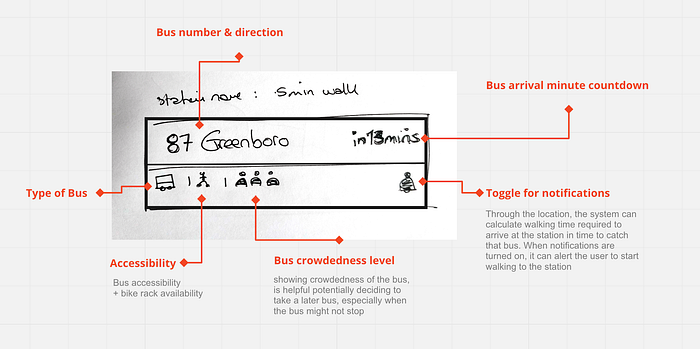
Route Card

Screen designs
For ease of use and quick recognition of buses, I think it is best to use the styles and colour coding use by OC transpo.

The case study did not include the full design of the app, but focused primarily on research and ideation. The above screens aim to show the proposed visual style.